According to the filing, Lipnik has been fired from Apple “for failing to follow Apple’s policies designed to protect its confidential information, including development devices and unreleased software and features.” The filing also accuses Lipnik of failing to report “multiple prior breaches” to Apple.
When you sign an NDA (non-disclosure agreement), you’d best protect the secrets. Then again, the guy who left an iPhone 4 in a bar didn’t lose his job. Wonder what the differences are between them.
Looks like shit IMO
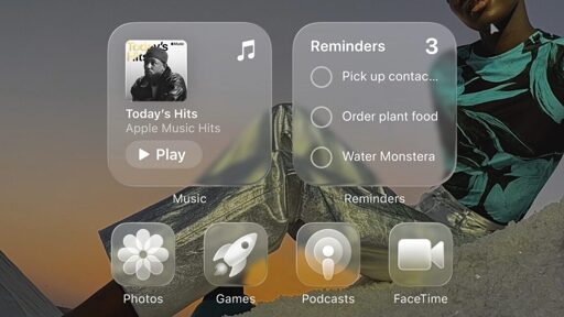
Kinda reminds me of Windows Aero, but with Grey as your main colour.
I’m on the fence, it’s nicer than material design (I’ve always hated ‘material design’ though) but it’s so colourless.
Bring back skeuomorphism!
At least material design is readable.
Actually, in the latest beta, they reduced the glass effects.
In case you missed it, find an iOS beta 1 video and see how they are rendering photorealistic light reflections on the glass UI…

Yeah, the white text on white backgrounds look pretty but is just not that easily readable.
What’s old is new again. “Glass” desktops and interfaces have made at least 3 rounds so far.
Windows Vista, is that you?
deleted by creator
Ahhhh yes, I remember glass Opera.
I miss that and I mean more than just the Frutiger Aero aesthetics. I miss what I felt back then when opening the browser, not knowing what awaited me today but in a good way. Despite everything, tech companies promised us a digital future that wasn‘t entirely dreadful. In hindsight it was all just escapism of course and another cycle of that trend would just feel painfully cynical today. It can never be replicated. Big tech will forever be flat design at heart.
It’s such an apple thing - “revolutionize” something that already existed
Ten years later, they finally replicated my iPhone 5 jaibreak theme and widgets! Well, partially.
What was that Cydia theming app called… it was titled in leetspeak, I think?
Gross. Why in the world would anyone want translucent icons?
Yes I’d like to strip away my ability to quickly sort mentally by color and I’d love it if there was a background image partially visible intermixed with the thing I’m looking for. Windows phone was peak UI. I don’t think transparency even needs to be a thing in an OS.
Microsoft changing Outlook from gold to yet another blue blob. Google changing every single goddamn app to use the same red/yellow/green/blue pallet. And now this bullshit.
Apple Vista
deleted by creator
Just to clarify something, because I think the majority of people here only know what iOS 26 looks like from the thumbnail. Below is an actual screenshot of the iOS 26 beta running on my phone.
Just like Android, things are customisable and the icons in the thumbnail are the most egregious version of the new visuals. I find it hard to believe anyone will actually use that styling tbh.

Even the non glass icons look terrible, they include some automatic blur being applied.
Intent. One was an accident, the other is potentially criminal if I’m not wrong. I could be.